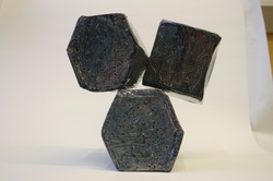
While making the Make It More, I used many different elements of art. Two of the main one that I think I used was shape and form. Part of the make it more projects was to incorporate other parts of our maquettes to make a bigger project. I took my beehive like maquette and put it into a box form (I took the shape from my last project and put it into this one). I extended the length of the box to make it bigger and enlarged to the whole project. I did that three times and stacked them into pyramid shapes. I was changing the form from and beehive to a box. Another element that I used was texture. Texture was used by making indents on each face of the project. The texture contributed to my project by changing the glaze color. When I combined two glazes the color changed when there is a low or high relief.
I used emphasis in my project by changing the colors in all of the indents. When I chose the color I knew that I wanted the color to change color when there was an indent of a bump. I incorporated proportion in this project by changing the size of the top hexagon. I purposely made it smaller and put it on its face instead of its side, like I did for the two bigger hexagons. The smaller one changed how you look at it. My project used unity because all of my hexagons had the same size of angles. The angle size allowed for the side to match up and look even on the entire hexagon.
I think that my make is more leaves you feeling a little anxious. The top hexagon does no look like it is stuck on very well, because of this it makes you want to change how it is sitting. The top one is smaller and is leaning on the other hexagons to give is a suspenseful feeling.
During this whole project I felt rushed. I was absent for a couple days while building this project so that lost time did not help. I feel like I could have done a better job on making the hexagons. With that in mind I feel like my project was really successful. I LOVE the color. It turned out exactly how I wanted it to even when I swapped how I did it. (Instead of putting silver on purple, I put purple on silver.) I do not like how the hexagons are not even on all the sides. Something went wrong where the sides did not match up and changed the shape so the hexagons were not the same.
 RSS Feed
