My favorite project this year was the mosaic. Creating the mosaic was a fun experience. I loved watching as different broken pieces came together to create one giant piece of art. We took the perfectly square tiles and threw them on the ground. We had no control over how each piece broke. The only thing that we could control was where the piece went once they were broken. This is my favorite project because I know that future classes will walk into the ceramics room and see some of the amazing things that they can do in this class. The mosaic will be stuck on that wall for a very long time and it is my mark on the school.
0 Comments
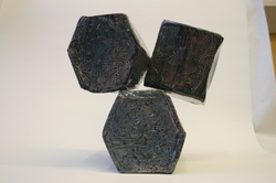 While making the Make It More, I used many different elements of art. Two of the main one that I think I used was shape and form. Part of the make it more projects was to incorporate other parts of our maquettes to make a bigger project. I took my beehive like maquette and put it into a box form (I took the shape from my last project and put it into this one). I extended the length of the box to make it bigger and enlarged to the whole project. I did that three times and stacked them into pyramid shapes. I was changing the form from and beehive to a box. Another element that I used was texture. Texture was used by making indents on each face of the project. The texture contributed to my project by changing the glaze color. When I combined two glazes the color changed when there is a low or high relief.
I used emphasis in my project by changing the colors in all of the indents. When I chose the color I knew that I wanted the color to change color when there was an indent of a bump. I incorporated proportion in this project by changing the size of the top hexagon. I purposely made it smaller and put it on its face instead of its side, like I did for the two bigger hexagons. The smaller one changed how you look at it. My project used unity because all of my hexagons had the same size of angles. The angle size allowed for the side to match up and look even on the entire hexagon. I think that my make is more leaves you feeling a little anxious. The top hexagon does no look like it is stuck on very well, because of this it makes you want to change how it is sitting. The top one is smaller and is leaning on the other hexagons to give is a suspenseful feeling. During this whole project I felt rushed. I was absent for a couple days while building this project so that lost time did not help. I feel like I could have done a better job on making the hexagons. With that in mind I feel like my project was really successful. I LOVE the color. It turned out exactly how I wanted it to even when I swapped how I did it. (Instead of putting silver on purple, I put purple on silver.) I do not like how the hexagons are not even on all the sides. Something went wrong where the sides did not match up and changed the shape so the hexagons were not the same.  On this sketchbook page, I had experimented with chalk pastels. It had originally started out as an idea that I had for the Make it More Projects. I incorporated the hexagon pattern. I chose this page because I love how the colors turned out. This page gives others bright, happy feelings and makes you think of a beehive. One thing I do not like about it is that the chalk rubs off when you touch it. If I could I would change the chalk pastel to normal pastels. One thing I learned was that the near constant pressure made the chalk rub off on to the other page and created a really cool affect.
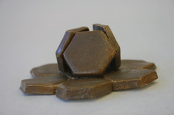 A maquettes is a little sculpture, the guild lines for this project was it couldn't be bigger than a softball. We experimented with different techniques and basically got used to working with clay again. Out of the seven maquettes that I made this was most interesting because of how simple it was. I didn't use any new texture only normal smoothness created from getting rid of the bumps with my fingers. I took a cookie cutter and pressed out the hexagon shapes, then I slipped and scored them together. The hexagon one was the best because of how hard it was to make. I had a hard time getting the three in the middle to stay sticking up. I had to put a paper towel in the middle but if the clay was to soft it would crumple and if it was too hard I couldn't stick it to other pieces. I think the next best would have been the flower because I like how it turned out. I didn't the two would stay stuck together because one of the flowers is scored and slipped into the middle of two petals in the other. The hardest one to glaze would be the one that looks like a volcano erupting because of how fragile the pieces were. I learned about glazing techniques. I hadn't realized that it was texture that would make the glaze change color. If I could do this maquette over and modify anything I would change the texture. The type of glaze if used was one that changes colors when the texture changes. This glaze looks dark on one texture and lighter on the other. Because the maquettes didn't change textures too much the color stayed the same. My maquettes reflect my style because I like to make thin papery like objects. All of them are either thin or they have a thin aspect to them. The hexagon one was made out of thin flat clay. I also used nature as an example; one is a flower, another is a bee hive like thing. I chose to highlight this page because I feel like it represents me. My favorite show is Dr. Who. Watching Dr. Who is one of the things that my dad and I do together. My sister and mom don’t like the show, so whenever a new episode comes on my dad and I watch it together. I have love for drawing cats to. Another page in my sketch book is another cat that I drew. The only thing I don’t like about this page would be the cats eyes. I tried to copy a picture of a cat eye that I found on Google but it didn’t turn out to well. I made this page by combining two sketches in pencil with a watercolor background and oil pastels to outline the cat. One of the new things I did on this page was putting straight oil pastels on and not rubbing it in. I learned that it rubs off on the pages next to it. I feel like this page tells others about some of my interests and hobbies; my love for Dr. Who and cats. This page took a long time because I wanted to work on the Tardis look real and 3-D. I’m not very good at sketching in 3-d. 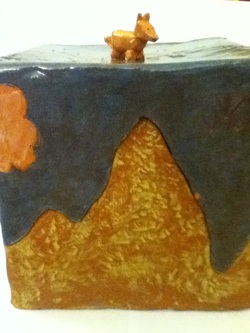 A puzzle box is a box that lid opens so that only one side can fit into another. You have to be able to tell the where one side fits with another. An example would be one side is a half circle while another is a triangle, rectangle and square kind of shape. You would be able to tell where the two sides fit and where they don't right away. My puzzle box is a box of mountains. One of the side has three mountains while another might be only one, and another is rounder than the others
I liked this project because it represents a big part of my life. I grew up in Colorado and the mountains where part of your every day life. I would wake up in the morning look out the window and see Pikes Peak. If I could change anything about my project it would be not using red clay. I didn't really like the red clay because when you where glazing you have to make sure the glaze color is dark enough to hid the red other wise you still see it. I had that happen when I was painting my clouds. I also wouldn't add my topper. One thing I really liked about my project was the texture of the mountains. I wouldn't have done that if Mrs. Jones hadn't suggested it, and I love it now that I did it. I know that while doing this project you where suppose to have an inspiration. At first I had one but I didn't really like how it turned out so I erased everything and started over going for mountains. 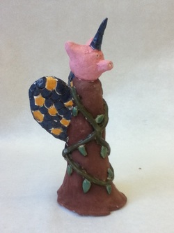 The object of this assignment was to make a figure that represented things about you. One thing I learned while doing this project was that it is hard to combine things that you like into one figure.
My project combined animals and nature and my love for the supernatural. Combining animals and nature actually was kind of easy, but it was hard to make them into something that others wouldn’t make. It got trickier when I tried to incorporate my love for the super natural. I started off by making the body a tree stump. Then I wrapped vines around it so I looked more like a tree in the rainforest than just a stump. On top of the stump I added the head of a pig. The back of the stump I put tropical bird feathers. If I could have done anything different I would have painted the vines differently. When I was painting it I painted the leaves one color while the vines another one. I should have just painted them all one color. The two greens I used didn’t go as well together than I thought they would. 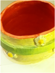 While doing this project I learned how to use slabs of clay to make something. I also learned that were the clay is joined becomes weak spots. They make it so that you have to be careful on how much clay you put on top of them; so that the weight doesn't make them cave in on it. I had to start over once because it caved in. I had a hard time making the weak spots better. They had to be able to support the weight of the clay on top of it. While doing this project I had a hard time getting rid of the lines that happen when you slip and score the two slabs together. On this inside you can see how I wasn't able to get some of them because they were weak spots on my vessel.
If I could change my project any I would make the decoration on the outside better. I don’t really like how it turned out. The stripes were one of those ideas that I get that are better in my head than when they turn out. I thought that they would be straighter, but because my vessel curves outwards I had a hard time making them line up right. 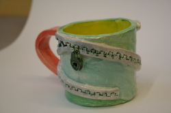 The object of this project was to create a usable mug with intricate designs on it. This project taught me that it patients is best. Another thing I learned was that I should work on is trying different things if one doesn’t work.
This project was not too hard for me. The biggest challenge that I had was creating the handle of the mug. I tried three or four times till I was able to get a handle that would stay on. The first tow broke in while they were drying. Then the third one broke when I put it on the mug. All three times there was too much moister in it to stay in the form that I wanted it to while on the mug and waiting for it to dry. I should have tried the pulling method instead of just rolling my handle. If I could have done better I should have tried things different ways before deciding that I just would do it one way. Another thing I should have done differently was use different glazes. I didn’t really like the colors that I chose. Before I glazed my project I really liked my project but now that i glazed it I didn’t really like it. I should have done duller colors. 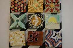 While doing the tile project I learned how to do additive and subtractive on clay. While doing this project I learned that it is better to have more clay when you are taking away clay so that it has a room for the clay to leave while leaving enough clay to still fire it. Then the opposite of that; you want littler clay when you are adding so that your project is not too heavy. This project was easy, yet hard at the same time. I found this project hard because I had a hard time coming up with ideas. After a while I came up with ideas and just kept them because I couldn't think of anything else. I think that this project was used to serve as inspiration for our future projects. The ideas that we came up with could be transferred to other projects or we could know what we like to do and what we don’t like to do, for future projects. I also think that project was used for Mrs. Murtagh to figure out what we can and can’t do as a class.
Some of the difficulties I had while doing this project were; coming up with ideas to use on my tiles. Some of the ideas that I came up with, I wasn't able to do or I couldn't come up with ideas that I liked. Another problem that I had was letting the tiles dry. A couple timed that I had tiles that I liked and wanted to put them in the kiln, I couldn't because they cracked and broke. They just cracked in the leather hard stage. I wish that I had glazed them better. On one of the tiles there is a whole area that I missed when I was painting it. I also don’t like that most of my tiles look the same with colors. I was using most of the same colors on all of my tiles without even realizing it. If I could have done this differently I would have took my time. I think that I was just going too fast and needed to slow down. |
Abbey MescherArchives
June 2014
Categories |
 RSS Feed
